Spark Magazine – What the hell…

Autumn 1999
Richard Hayter
Richard, one time designer at Generator, was always a stickler for detail and not one to hold back when he spotted design work that fell below par. Richard has now moved on from our illustrious ranks and is currently Executive Creative Director at CST The Gate in London.
All design and illustration work created by Generator Creative Consultants
© Generator Creative Consultants 2020
By Richard Hayter
What the hell is wrong with British graphic design these days?
From the Autumn 1999 issue of Spark Magazine
‘Rebels’, a classification to which many designers aspire, regularly spout the old adage “Rules are made to be broken.” Undoubtedly, this is sometimes true. Unfortunately, many British graphic designers seem to have adapted this old saying into “Rules are made to be completely ignored so that my work looks slapdash and half-arsed.”
In the last year or so, spark has noticed that those subtle details that make our job at once an enormous pain-in-the-arse, but which also separates us from the ‘d.t.p.’ armed hoards, are being ignored. It’s a return to the days when designers didn’t know that you could get proper apostrophes and en-dashes out of a Mac keyboard; it’s like 1989 all over again.
And I don’t just mean on the little jobs. Take a look at photo a. This foot mark features in the branding of a nationwide chain of wine bars; even in the 24" high neon lighting that forms it’s signage. It should, of course be an apostrophe – why didn’t anybody during the whole design, approval and construction process notice this? The designer in photo b has committed the same sin. This branding was produced for a footwear firm, moving into the ‘street-fashion’ market. Would the logotype have looked less ‘industrial’ using an apostrophe? The shame is, this mistake mars an excellent suite of labels and packs.
The same malaise is creeping into some of the UK’s usually peerless TV graphics, too. Not only are designers ignoring quotes and apostrophes, but has anyone actually tried to read programme times on a centred list?
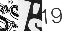
It seems that ‘kerning’ has become a bit of a dirty word, too. I wouldn’t expect most designers to kern body copy, but headlines are a different matter. And what about headlines with dates (see photo c)? How can anyone leave that chasm between the ‘1’ and the ‘9’ in 1999?

It would be unfair to give the impression that all current British graphics are falling down when it comes to the detail – there’s a great mass of excellent work being produced in this country for clients from all over the world. However, spark is not alone in noticing this downturn (see ‘An Old Boy Looks Back’ on page 6). Maybe some of you will think things like this are unimportant – that the overall concept is what’s should dominate, not the fine detail. But surely, part of being a professional designer is that we understand that detail is what underpins the concept? Just about every job seems to be rushed these days – but really, how much time does it take to perform a ‘Find/Change’ for double spaces or hyphens that should be en-dashes, in QuarkXPress? Kerning headlines takes only a few minutes. Page layout and word processing software will automatically place the correct quotes and apostrophes in copy for you (with the exception of shortening dates – 1999 will become ‘99, when it should be ’99.)
Maybe it’s the latest crop of design graduates that are making these oversights. Maybe they just haven’t been taught about these things? The question needs to be asked “Why the hell not?” Why aren’t senior designers and art directors picking these things up and passing their knowledge on? If you have any answers or comments about this, or any other subject covered in spark, write or e-mail us. Get it off your chest!